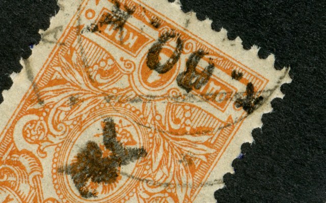
Let’s start with a statement: Cancels besides Erevan or Aleksandropol are a rarity on stamps of the Dashnak period [Ceresa]: namely framed and unframed Z overprints on Tsarist stamps. So when I got this stamp for certification, I was quite excited.
The cancel has all the characteristics that are typical for a genuine imprint.
This is a fine example of the Igdyr * * a cancel – here used on the 20.2.1913. Ashford lists this stamp as Type 3 – the bigger one of the serial “a” cancels with the 28mm diameter. Zakiyan show it as Type 8 in his latest book. But neither Zakiyan nor Ashford or Tchilinghirian or Ceresa report this cancel on Dashnak stamps.
The stamp itself shows an unframed Z on 3 Kopecks. Michel number is 31a and the catalog value – if genuine – would be 170€. This is for used with the most common cancellation – Erivan or Aleksandropol.
But here is this stamp with an Idgyr cancellation. Igdyr is a small town 50 km away from Erevan, over the river, located on the plains right before Mount Ararat. It was part of the first republic but on October 20, 1920, the Turks occupied it and the territory would not be regained later.
A usage in Igdyr would seem to be possible. However, the unframed Zs appeared not before 1920. A cancellation in 1913 is not possible.
The unframed Z itself shows not the typical ink of the genuine overprints, and the shape is also incorrect – especially visible on the “handles” of the Z.
This clearly is a forgery. The unframed Z was applied at a later time. Remains the question, why would a forger do this? Perhaps he was aware of the rarity of the combination of cancel and overprint? We do not know. Still, it is nice to have a genuine imprint of the Igdyr cancel.
PS: The “1” of the “1913” year can clearly be spotted on the enlarged fragment.
I am a big fan of multiples. You can see how the “human factor” of the manual approach results in specific differences of the individual overprints. Each one was applied in a single step. So, without further ado, here is the beauty:
As an additional feature, this one shows a prominent error: one stamp has a 5r overprint instead of a 3r.
Checking the overprints
Let us start with the 3r HH. This overprint was not forged that often. Most likely because it is quite common, and the catalog values are low.
Shape, ink and style are ok, there is no indication of a forgery present and therefore is accepted as genuine.
On to the “5r”.
A first visual inspection shows:
The ink of the “5” is different from all other overprints. Less black, more grayish. The “5” must have been added in an extra step, perhaps even much later.
The “r” seems to stand way too much to the right in comparison to the monogram.
The ink of the “r” matches more the monogram and the “3r” ink.
The shape of the “5” itself, especially the end of the foot looks a bit untypical. There seems also t be a “curb” in the belly of the “5”. Like, the lower part was added or is from another hand stamp.
In general, a “5r HH” overprint can be created by either simply using a complete “5r HH” hand stamp or by combining parts of different hand stamps. The latter is done in several steps. Perhaps the lower part of the “3r HH” hand stamp did not print, or it was deliberately prevented from printing by tilting the hand stamp or use of paper. In a second step, the missing parts were added. It is even possible the “r” was added from yet another hand stamp.
Let us start with the easiest and most common variant, a simple “5r HH” hand stamp.
The “5r HH” hand stamp comes in three types. The only possible match, due to distance “5” to “r” and shape of “5” is type T3. For this one to be genuine, it would necessary that the monogram and the “5” were produced individually. The “r” could belong to the monogram or even have been added in an extra step.
The distance between the “3” and the “r” seems to match quite nicely. It is also possible that pat of the “3” was printed and got over stamped by a “5”. This could possibly explain the clunky shape of the resulting “5”. The shape of the “r” seems to match the “r” of the “3r HH”. Still, the distance and angle between “r” and monogram is not fitting.
Checking the different types of the small “HH” monograms is only possible if the present imprints are especially clean and clear. In this case, the quality of the overprint is not good enough.
Conclusion
The “5” looks untypical, and the shape differs from genuine examples. While there is a small chance that this is the result of the manual work, the result leaves a lot of doubt.
The item is therefore considered “doubtful”. It is neither a clear forgery nor a clearly genuine stamp. This is understandably not satisfying, but an inherent problem of this interesting field. In the end, it makes the clearly genuine items even more desirable and valuable.
The Raritan Auction #93 presents several stamps, including a description reading
“ex-Zakhary Umikov”.
Since the Auctioneer put this in the text, I assume, he wants to get a message to the potential buyer. Perhaps: Signed by an expert; or ex collection of a serious collector who spent a lot of time researching the material. He added some more well formulated text:
“very rare, only a few stamps recorded”
Let us have a look at the stamp so lovely described.
Lot #847
To make a long story short: this is an abysmal badly executed forgery. Certainly, there are well executed forgeries, who need an expert opinion or some extensive research. A dealer cannot be an expert in all areas. But this is such a crude attempt.
We also learn, that ex Zakhary Umikov is not something which helps distinguish forged from genuine overprints.
More forgeries ex Zakhary Umikov
Lot #849
Another “old friend” are these newspaper forgeries. Beware!
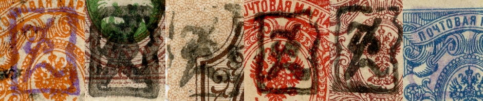
The cancels used during Dashnak and Soviet-Armenia times are generally well known and described. Some are very rare, others quite common. Especially the ones used for cancelled to order purposes are plenty. Next come the ones of the large cities and centers, Erivan and Alexandropol.
This stamp however shows a cancel I was not able to match with the lists in the literature (from Zakiyan to Tchilinghirian + Ashford).
Rotated and cropped.
Characteristics:
First character is an “A”
The Name starts exactly at 9 o’clock, between the horizontal lines.
The horizontal lines are thicker than usual, still not as thick as the Alexandropol “sh” cancel.
Two asterisks/stars at 6 o’clock and at the position of the lower horizontal line.
Starting with “A” are: Alexandropol, Allaverdi and Ashtarak. When looking the medium thick horizontal lines and the starting position at 9 o’clock, it seems Alexandropol “sz” is the only possible match.
When aligning the horizontal lines and the asterisks, the following “errors” appear:
“A” in wrong position / distances between asterisks and “A” incorrect
horizontal lines not thick enough.
One explanation would be that this is a receiver stamp and as such could anything. Still seems unlikely. Suggestions welcome, or perhaps I missed something?
As a general rule, the surcharges used came in different styles:
with serifs or without serifs
thin lines or thick lines.
Sometimes it is difficult to spot the differences. For example, this stamp: what type of surcharge was applied?
Let us take a closer look.
This is a very common/typical style variety of the overprint: the ink diluted and the border thick, while the inner body of the numeral seems almost to be hollow. The cancel obscures the shape additionally.
The arrow “1” shows the tip of the numeral. This is a common feature of both, the overprint with serifs and the one without. The arrows with the “2” show the foots left and right at the base of the numerals. These feet are the distinctive and unique characteristics of the serifs style surcharge.
The latest addition to my collection is this blank Zsarist postal stationary, surcharged with 5 Rubles and cancelled to order Elenovka “b”. Those stationary were produced when new, not 30 Kop. overprinted, stationaries were received from country districts. At some point the owner of this postcard had it cancelled to order in Elenovka. Perhaps on the way to Tiflis. Serebrakian and Boels come to mind but since nothing was written on the card this is pure speculation.
Elenovka was a post station on the important road link between Tiflis and Erivan. Located on the western shore of Lake Sevan.
Imperial Russian Stamps Used In Transcaucasia – P. T. Ashford
Postal Stationary surcharged with 5 Rubles including HH monogram. C.T.O. Elenovka Eriv. / * * b
The date is unreadable – year seems to be 20. The Elenovka cancellation is quite rare. Zakiyan number is S21. Ashford only lists two different cancels for Elenovka at all. This one being Type 2 used between “? 1913 – ? 1923”. All the examples in my collection show the same weak ink.
The overprint shows the typical ink and shape of the genuine 5r HH Type 3.
The manual overprint process in combination with a wide variety of ink(s) used, based on what quality and ingredients were present, lead to quite a range of different overprint appearances. T&A describes is a the “human factor”. This can be seen as a thing of beauty that well documents how the work of the postal organization was done in the difficult times of war, hunger and inflation. On the other hand, it proves be a hurdle when to distinguish between genuine overprint and forgery.
A lot can be learned from larger multiples and sheets. An easy and useful start is to understand, that the variety in ink is a sign of a genuine overprint. Overprints need to vary from stamp to stamp. A multiple with identical overprints is most likely digital forgeries. Genuine overprints vary in:
Position on each stamp
Ink density – reinking was applied after two or more print processes
Ink distribution – characteristics of the usage of real ink like oiliness, dust particles adhering to the handstamp, unequal distribution of the color (e.g. prominent borderlines)
Here are scans of two half-sheets of the 500 ruble Essayan pictorial issue, one with and one without overprints. Both are the lower half of a full sheet. Full sheets were normally cut in half right after the printing process, since the large size was cumbersome to deal with. As a result tête-bêche items are quite rare.
Lower half of 500 ruble sheet with overprintsLower half of 500 ruble sheet without overprintsExample of ink getting weaker before reinking the handstampExample of double overprintExample of weak and clear overprint
This is excellent to study the characteristics of the genuine overprint. Most prominent ones:
gaps a bit left of the center on top and bottom of the zero
oval shapes inner part of the zero
ball shaped serife at top of the two
narrow part at the bottom of the “swan nack”
upward looking serife at the end of the baseline of the two, slightly tilting to the left
straight and kinda thick horizontal base of the two
Typically, not every imprint of the handstamps allows to see all these characteristics. This means, when provided as single stamp, a lot of overprints can not safely be checked as genuine. This is just part of the nature of these overprints and reduces the amount of genuine stamps of a given catalog number below what was historically produced. Typical and well shaped (impressed) overprints are a quality sign of especially collect-worthy stamps. And may be more expensive.
Plate markings and field positions
With the lithographed stamps from the picture issues another interesting option arises: the possibility to check the position of a certain stamp regarding its place in the sheet (field position).
The most prominent plate mark of the 500 rubles stamp is the “lightning”.
Plate mark “lightning”
Within the lower sheet its position is here: 4th row, 5th stamp.
Position of the “lightning”
Since I got two different sheets I can also see which “plate flaws” are generally present and which are “random” or perhaps happened during the print run – e.g. when the stones were damaged after the printing process started. Of course these are only two examples but when comparing this with the described plate flaws in the literature, the results seem to be valid enough.
Here I put an red arrow on each characteristic “flaw” I could find on both sheets. The blue arrows show “flaws” that are only present on one of the sheets.
Plate flaws in red
Scans I got from Rafael that belong to the comment below:
500r A tree on the mountain variety500r A tree on the mountain variety reverse500r A tree variety, Zakian marks
While working on the Transcaucasian Star Overprints (used almost exclusively in Azerbaijan) I found a scan of this Money Transfer Form ex B. Taylor collection.
Late and remote use of Star Overprint – also underlying Armenian framed Z
This item is extremely rare and interesting for the following reasons:
Latest documented use of Star Overprints. Ceresa assumes because of the remote location new stamps did not arrive yet.
Shusha is one of the larger cities in the region that now is part of Nagorno-Karabakh (nowadays de-facto under Armenian rule).
Nikolaevka is probably only a small village. The location of which is unknown.
A rather high amount – it is inflation time, but in comparison to other money transfers.
Franking with perforated 1 Ruble stamps with Armenian large framed Z.
Addressed to Shusha, the item bears the cancel of Shusha Elisavetpol.
Shusha Elisavetpol * * b – Ashford Type 11
It was sent from Nikolaevka Elisavetpol.
Nikolaevka Elisavetpol * * a (Ashford with no type or image)
Ashford describes Nikolaevka as village with postal sub-office. Apparently he had never seen the cancel himself and references Voikhansky:
Nikolaevka was a village lying remotely in Shusha Uezd, beyond Agdam. The P.O. was opened sometime after 1893. No datestamp can be illustrated, though E. S. Voikhansky lists a double circle datestamp (serial “a”) used on stamps of Azerbaijan. This could have been in use pre-1918.
Ceresa shows another late used item with Nikolaevka cancel in his books and also refers to this Ashford text.
Voikhansky just lists the cancle in a table of stamps used 1919-1923 as Nikolaevka Elisav. “a” double circle (18mm, 28mm) in black and in yellow-black ink.
I tried to find the village on old maps but without success (e.g. Zsarist maps of 1905 and also later ones). There are also no references on the internet etc. Ashford shows the location on his hand-drawn map, but there is nothing on the the geographical maps I referred to. The name Nikolaevsk may have been given to a settlement where Russian settlers lived (Zsar name). Or an already existent village was renamed and later this was changed back to the former name.
The only Nikolaevka I could find is a village near Shemakha. Source Wikipedia.
İkinci Cabanı (known as Nikolayevka and Dzerjinovka until 1999) is a village and municipality in the Shamakhi Rayon of Azerbaijan. It has a population of 834. The municipality consists of the villages of İkinci Cabanı and Cabanı.
There is also a reference in a Wikipedia Article about Russians in Azerbaijan.
While it is possible that Ashford made a mistake locating this village, the problem remains that the cancel reads “Elisavetpol Gubernia”. And the Nikolaevka near Shemakha is in the “Baku Gubernia”.
This is a real riddle. I hope some of my readers can help.
PS: And here comes the help from Arkady Sarkisya (see comment). Thank you very much, this is just great! I would never have found this alone.
The Nikolaevka postal sub-office is located in a Russian village in Shusha Uezd on the main road from Karyagino (Karyagin Uezd) in the South towards Terter in the North (Djevahshir Uezd) through Agdam on the former Imperial postal route Karyagino-Nikolaevka-Khonashen-Kotlyarovka-Agdam-Terter. Nikolaevka is located approximately at a distance of 33 km from Shusha to the East, almost equidistant from Karyagino and Agdam at a distance of about 28 km
I tried to mark it on this map section from a Russian map issued in St. Petersburg in 1909. You can see roads and postal office marked!
Area around Shusha
I found Karyagino in the South following the road north then Shusha, Agdam and Terter. But I can not see a road from Shusha to the east and also if I draw a line from Karyagino to Agdam I go through Shusha rather then being east of it. Where did I go wrong? And were is Khonashen and Kotlyarovka?
Here is an overview of the area nowadays done in google maps. 22 km east of Shusha, directly would be over steep hills, but anyways not on the road to Agdam or Karyagino.
The Karyagino I found near Tatev is most likely the problem. Here is another map section showing a route from Uezd south of Shusha and Agdam, passing west of Shusha. This relates to the distance of the 28-30 km east of Shusha and Ashford draws Karagino north of Vank.
Post offices around ShushaPostal routes around Shusha (parts unsure)
Update: The riddle is solved. A reader sent me this map picture where Nikolaevkoe can be seen east of Shusha. Very nice!
Recently I bought some postcard / cover with cancels from the Caucasus region I found attractive and wanted to add to my cancel collection for later reference. Also useful for documenting used inks and types of devices.
When I received the item I made a high res scan (2400 DPI) and had a look at it on my large size monitor to check the cancels and other details. Next step is checking the literature e.g. Ashford for his remarks on the cancels and serial characters. Then checking the Text on the card itself. Is it some person or organization of importance.
Postcard with Dzhulfa-230-Tiflis *a* cancel
What I did not see on the ebay scan but stuck right to my eyes now was the problem with the cancel on the stamp.
Postcard detail stamp and cancels
The stamp can not be part of the original card. The cancel does not match. Also the date on the cancels outside (1908) is several years before the date on the stamp (1915).
When contacting the dealer he admitted the fault and asked me how to detect such problems when buying from clients for later reselling.
There are several problems that usual arise with postal items lets discuss some of the most common ones. This one is a nice example for what to look: always check the area of the stamps and cancel:
Does the ink of the cancel look typical? How does the ink of the cancel compares between parts that are on the stamp versus parts that are on the paper. Be aware that there might be normal differences due to the different materials. For instance when the stamp is chalked the ink cannot penetrate and is often smeared.
How is the transition of the cancel from stamp to paper and vice a versa? A small gap is normally ok, when not too much pressure was applied. The stamp lies “elevated”. When no part of the ink is on the paper be cautious.
When the same cancel is applied several times, check for differences between each impression. Keep in mind that the clerk not necessarily re-inks every time. In this case the upper impression was applied first and then without re-inking the second on beneath. Just a bit weaker.
Look for date figures, serial characters and other striking characters. Forgers often struggle with generating the same distinct font type. Check serifs.
Here is another example, I got from a reader of the blog.
Cover with added stamps
Aside from the fact that the overprints on the stamps are faked, a comparison of the cancels from front to back part shows obvious differences in ink, texture and shape.
Compare ink and texture!
Quite obvious when comparing directly, but not so easy with a generic low res scan…
Another interesting example. A postcard going from Delishan Elisavetpol to Nakhichevan-on-Don (do not mistake with Nkhichevan in Armenia).
Postcard from Delishan to Nakhichevan-on-Don
A nice item with a genuine Armenian overprint none the less. But something is missing.
Something is not right
Why is there only a part of the cancel visible? Again a case of missing stamp. Why was the stamp removed?
Because the Armenian overprint was covered.
Because the postcard was sent on 1924 and at that time a generic soviet stamp was used – which kind of devalued the item.
It is not unusual that “old” postal stationaries were used at a later time when the original charge was not valid anymore.
Another general question is: should be there a stamp on the cover / card or not. Normally we expect a track of franking on every item. Some exceptions are:
mail of army organisations often is free
mail of specific stately organizations e.g. communist party can be free
no stamp was at hand and postage due value is written on the item
When no stamps are present, some reason for this must exist.
Here an example where the missing stamp is not so obvious.
Where is my stamp?
You can still see that the paper is damaged where the stamp has been. The frame of the “mesto for stamp” is only partially present. Some effort was put into patching this up and generating a smooth surface.
While
gathering material for a collection of the Transcaucasian star overprints I
bought the following item.
Letter from Baku to America front-side.
A bit
roughly opened but looking quite interesting and showing a lot of cachets and
added script texts. A typical oversee letter.
There are
all kinds of nice cachets in this. First of all the cachet of the Baku town
sub-office no 1.
The corresponding cancel BAKU 1 “* e *” (Baku town sub-office no 1) is the Ashford type 87 cancel introduced in Soviet Azerbaijan period and used till 1923.
In New York several more cachets were added:
REGISTERED
FORWARDED N Y P.O. STA.
MISSENT. N.Y.P.O. STA G
Directory Service Given Englewood Station.
The address is in red ink and reads as follows: A. Tamiroff; Al. Jolson’s 59th; Theatre, Moscow Art Theatre, Chicago
Akim Tamiroff (Armenian name Hovakim Tamirian) was an Armenian-American actor, born in Baku. He learned in the Moscow Art Theater and moved later to the United States where he was very active in the movie business, participating in more the 80 movies – enjoying a successful Hollywood career.
Al Jolson (Russian-born) was at his time (1920s) America’s most famous and highest-paid entertainer. A theater in Manhattan (shown in the address) was named after him.
The first mystery of the letter is the address. It is a mixture of three different locations:
Jolson’s 59th Street Theater in Manhattan New York (can be found in Wikipedia)
The Moscow Art Theater is a theater company in Moscow. (also in Wikipedia)
Chicago
Moscow, New
York, Chicago? Which is correct? Moscow Art Theatre possibly means he was part
of a group of actors touring the States. Perhaps they visited Chicago?
The post
office of New York tried to make sense out of this and corrected the address.
However, the only thing I can decipher is “39th St(reet).”
The sender can be found at the bottom of the front side and reads: “sent[or]sender/ Baku, Kladbishchenskaya 100 [cemetery street], flat of M. D. Dzhafarov, P. M. Kara-Myrza for A. M. Tamirov/. “.
So it was written to him by Mr. Kara-Myrza on his behalf. The reason may be some bureaucratic requirements that needed to be fulfilled so the letter could be sent abroad.
The next
mystery is the timing of the letter. According to the Wikipedia article
Tamiroff visited the United States for the first time in January 1923, staying
for three months and returning later in November staying till 1924. The cover
tries to reach him in June 1923.
Letter from Baku to America front-side.
The franking is made out of a block of ten 35 Kopeck stamps with a red star overprint and five 10 Kopeck stamps with a black star overprint. According to the used revaluation scheme of the RSFSR the Kopeck face value is multiplied by 1 million giving the new value in Rubles. A possible exception is the 35 Kopeck stamp where some source give the value as 30.000 Rubles instead of 35.000 Rubles. As a result the franking is either 350,000 or 400,000 Rubles. There are also a lot of receiver cancels of the New York post office but no Chicago cancel can be found.
The ink of
red overprint is partially water-soluble which can be seen at right side of the
star on this detail view.
All other stamps were overprinted using black ink. There is only on exception, a rare variation in blue ink.
Privacy & Cookies: This site uses cookies. By continuing to use this website, you agree to their use.
To find out more, including how to control cookies, see here:
Cookie Policy