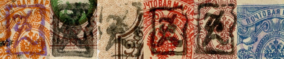
As a general rule, the surcharges used came in different styles:
- with serifs or without serifs
- thin lines or thick lines.
Sometimes it is difficult to spot the differences. For example, this stamp: what type of surcharge was applied?

Let us take a closer look.

This is a very common/typical style variety of the overprint: the ink diluted and the border thick, while the inner body of the numeral seems almost to be hollow. The cancel obscures the shape additionally.

The arrow “1” shows the tip of the numeral. This is a common feature of both, the overprint with serifs and the one without. The arrows with the “2” show the foots left and right at the base of the numerals. These feet are the distinctive and unique characteristics of the serifs style surcharge.