The 20 Goldkopeck overprint is quite common. Still the forgers did not neglect it and we can discuss the different types of forgeries.
This is a genuine overprint on a genuine basic stamp. Please not the blue signature on top – this is the only case I know that a signature was deliberately placed on top of a stamp. Also a prominent plate error (or fault) can be seen – the thick line starting to the right of the farmer and going up though the hills.

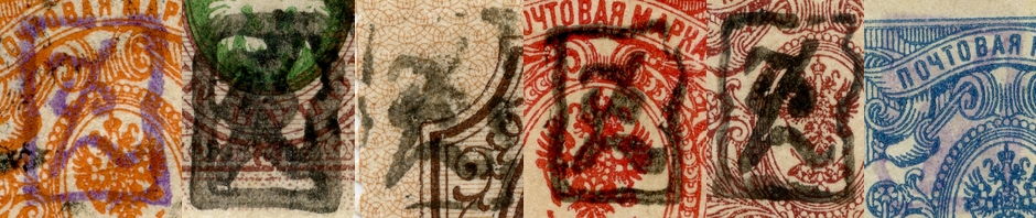
Here is another genuine overprint on a genuine stamp, but the basic stamp shows the quite rare color rose. A nice item from early printing with clear design.

And another genuine overprint on a genuine stamp with a nice cancellation from Karaklis-Erivan a.

Enough of the genuine ones, now come the forgeries, starting with this item. Basis stamp is genuine. The overprint looks wrong and is kind of hollow in appearance.

Next come two examples of the “thick ball” forgery. A lighter imprint and a heavier one. Again both basic stamps are genuine.

This stamp has the notorious signature “UZ” which is almost always the sign of a forgery.


Last type of forgery at first on a genuine stamp and then on a reprint (forged) stamp.


Both stamps are signed like this. I don’t recognize this signature, if you do, please leave a comment.


Now let us have a look at the overprints in detail and discuss the distinct characteristics of each.
The genuine overprint Twenty
The genuine overprint looks like this. You can see the variances in the imprint regarding the ink used and if the device was cleaned or not.


The characteristics of the genuine overprint.
- very narrow neck end
- well rounded and full ball
- very narrow start of neck
- thick base line almost like a beam, slight rounding on upper line
- tip serif with slightly tilting to the left, sharp tip
- neck with distinct thickened middle part, peculiar shape
- typical gap at 11 o’clock
- typical gap a bit later than 6 o’clock
- the two parts of the zero embrace the space in between like two parentheses; the “walls” to the left and to the right are almost without rounding and go straight up with the only exception at the peaks – compare the shape of the zero with the 50k overprint!
- like the neck of the digit two the zero shows typical thickening in the middle

- ink from the cancellation
- the base of the neck is thickened due to the heavy, strong ink
- the cancel was not cleaned and small fragments from dust gathered with half dried ink to produce this protrusion
The forgery type 1: Hollow!

- base of neck is not narrowed
- the ball-serif of the digit two is too small (and the neck where it connects not narrow enough and not in the correct shape)
- the imprint is kind of hollow and in a definitely untypical kind of ink
- the upper gap is at the correct place but looks like broken out not like too narrow to print
- the middle sections of the “parentheses” are not thicker than the rest of the zero digit
- the bottom gap is missing – and this is not because a too heavy ink is used
The forgery type 2: Large ball!
- the base of the neck of the digit two is not narrowed (biggest fault #1)
- the ball-serif is way too large (biggest fault #2) almost or even touching the neck
- the base beam is not long enough (horizontal-ways)
- the upper gap is missing
- the lower gap is missing
- the forger did a good job with the zero digit though, the widening in the middle is well done and the inner shape of the zero is almost like the original
The forgery type 3: No ball!

- no ball and no narrow neck end – the neck simply goes into a curve
- the base of the neck of the digit two is narrow – good job here
- the beam is too short and the tip is missing (!!!)
- no top gap
- wrong shape of the thickened parentheses
- no bottom gap
Many many thanks for the brillant work you have done, once again. I am a new comer and just starting in this area… I think the expert’s signature might be Thiers?!
What a great site! The unknown signature looks like Hurt, the H written the way I learned to write it back in the early fifties.
Great site! congratulations!
the unknown signature looks like Hurt to me, written the way I learned to write in the early fifties.
The blue lozenge signature on the front of these stamps, which has two added stars added separately and thus in varying positions, is the ONLY signature for which there is not one forgery in my signature collection of over 2000 signatures,( which one day I hope to publish). I believe this to be a control marking used by the official distributors of the residual stocks released by the postal department of Armenia to identify genuine material and differentiate it from reprints and forgeries. For the collector the absence of the marking makes a better display but its presence is a guarantee of genuineness. One must not be taken in by digital scans of the marking applied to the face of this issue -they are good copies but every one is the same since the scan is a one pass scan. (No forger has yet , to my knowledge, scanned the diamond lozenge alone and then added scans of the stars as second and or second and third stages).